
Project Overview
Project Overview
Project Overview
Client: Din Munte
Product: Natural bath salts in multiple variants
Target Audience: Health-conscious consumers seeking relaxation and natural wellness products
Tone of voice: Refined, calm, trustworthy
Client: Din Munte
Product: Natural bath salts in multiple variants
Target Audience: Health-conscious consumers seeking relaxation and natural wellness products
Tone of voice: Refined, calm, trustworthy


Project Goals
Project Goals
Develop premium and elegant label packaging for 5 bath salt variants
Reflect the natural, therapeutic essence of each product
Reinforce brand identity and create visual differentiation
Create complementary social media visuals that translate packaging design into digital storytelling
Develop premium and elegant label packaging for 5 bath salt variants
Reflect the natural, therapeutic essence of each product
Reinforce brand identity and create visual differentiation
Create complementary social media visuals that translate packaging design into digital storytelling
Problem
Problem
The client needed a packaging design that would stand out both on shelves and online, reflecting the high quality of their natural ingredients without overwhelming the viewer. Additionally, they needed a visual system scalable to future product lines.
The client needed a packaging design that would stand out both on shelves and online, reflecting the high quality of their natural ingredients without overwhelming the viewer. Additionally, they needed a visual system scalable to future product lines.

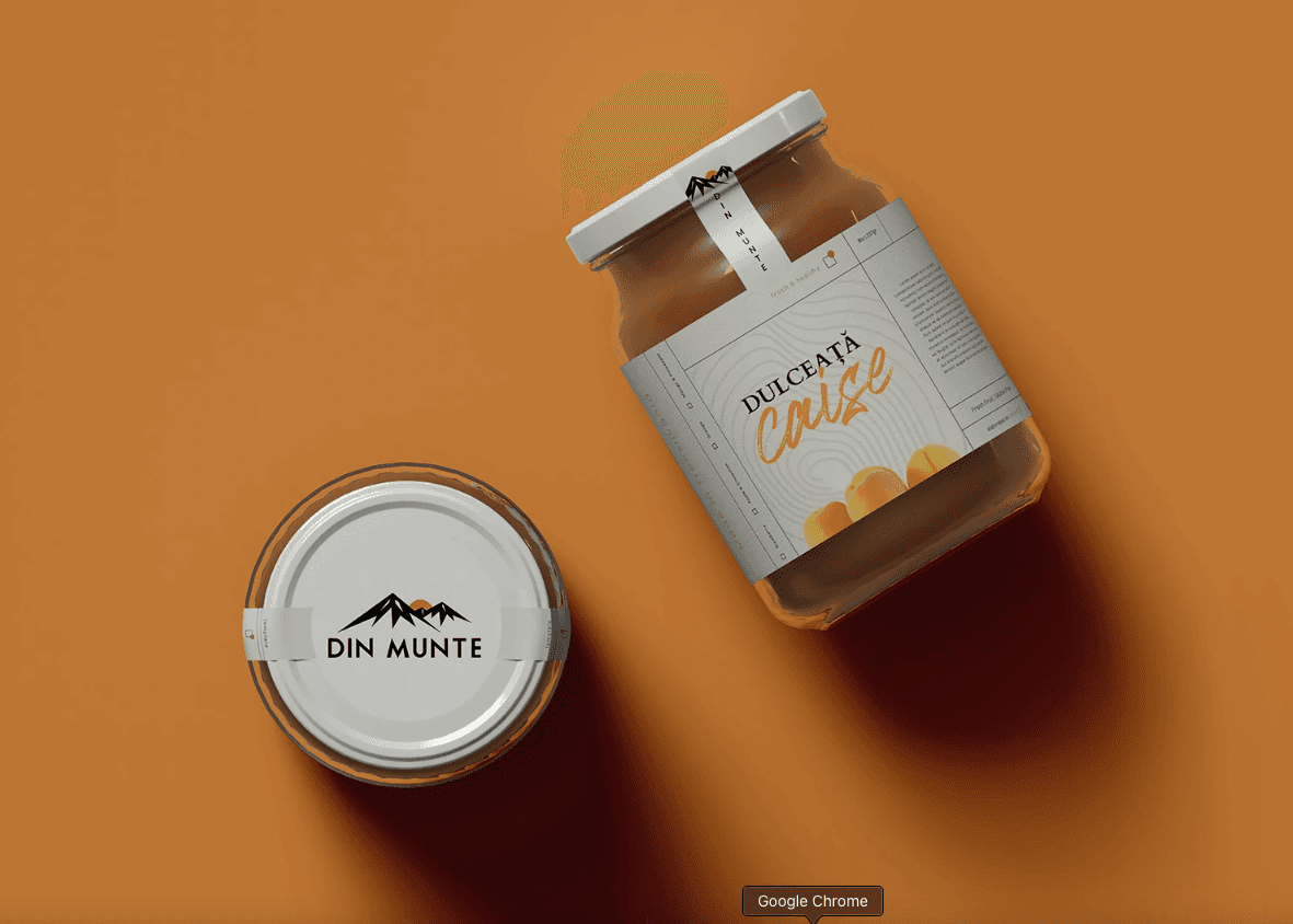
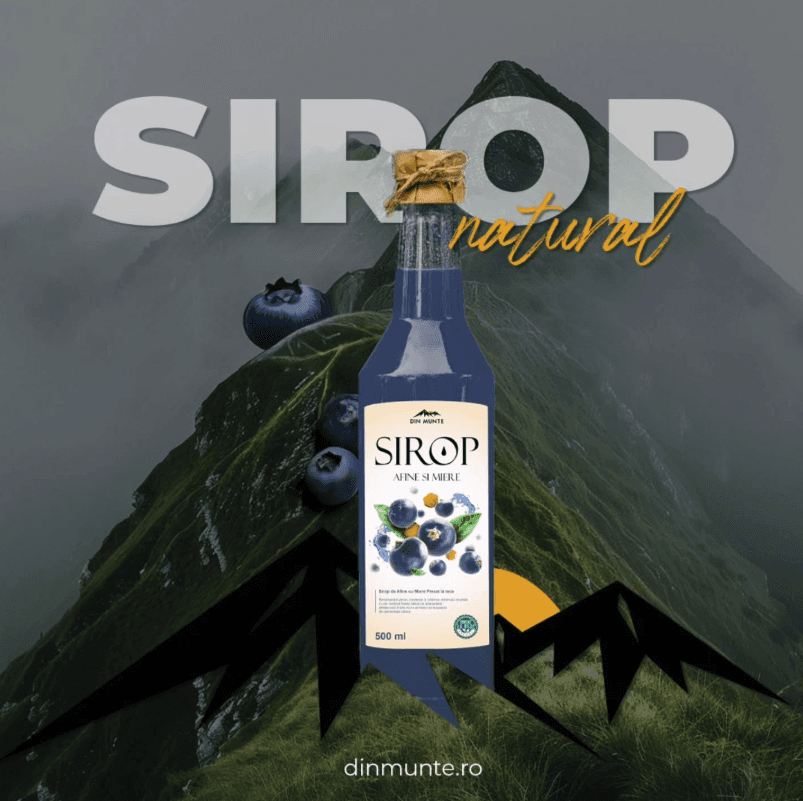
The Label Design
The Label Design
Aesthetic Meets Function
Aesthetic Meets Function
Each label is built around a central layout grid ensuring clarity and hierarchy. I combined:
Classic serif typography for a premium, natural wellness vibe
Modern sans-serif for legibility and contrast
A top banner with the Din Munte logo, subtly integrated to preserve branding consistency
Carefully spaced zones for product name, scent type, and usage details
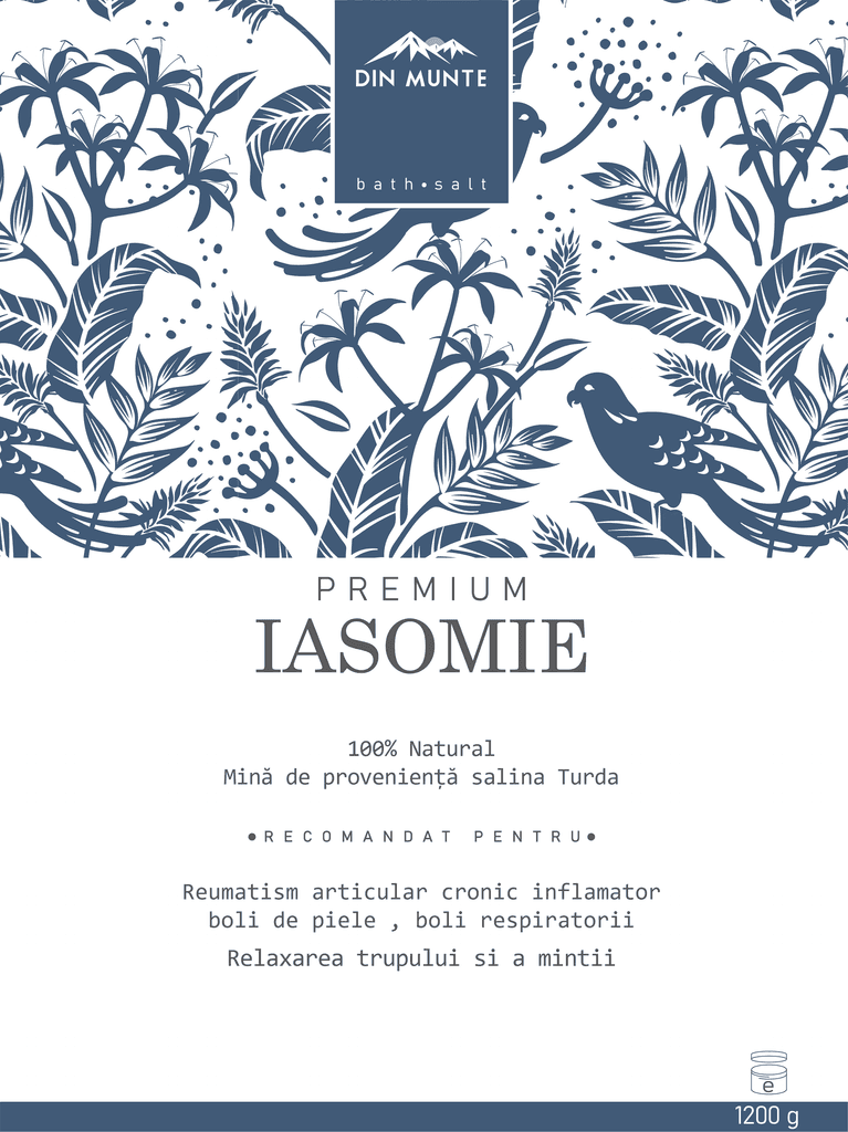


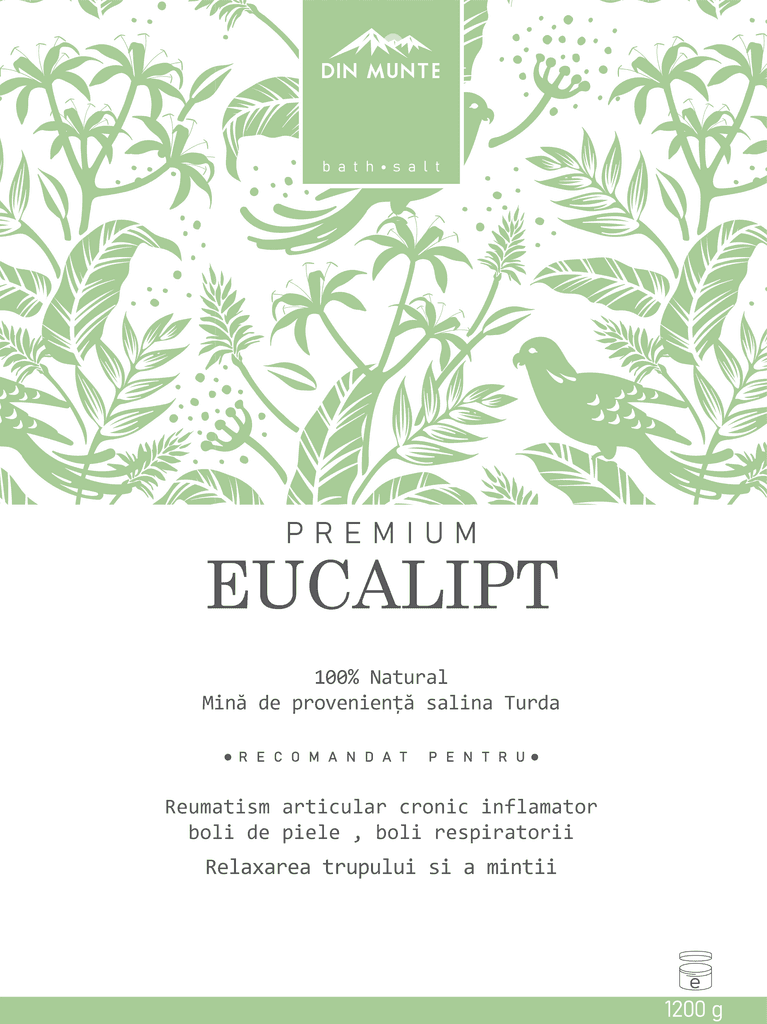
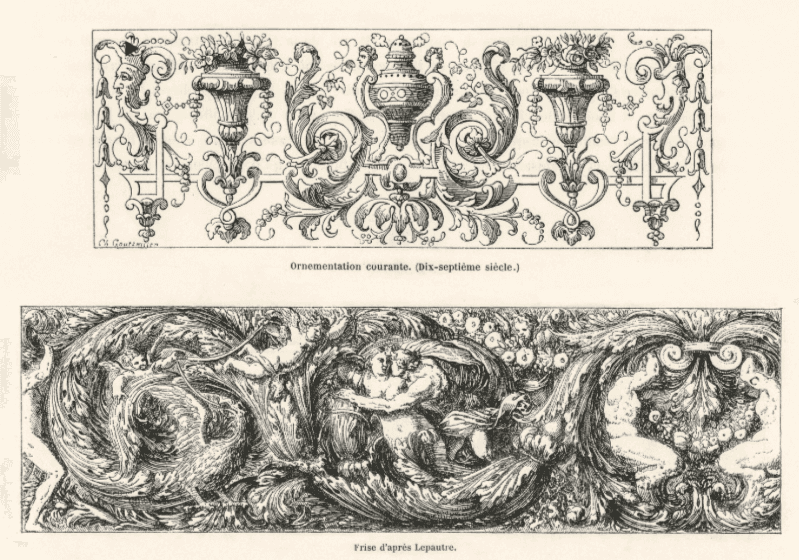
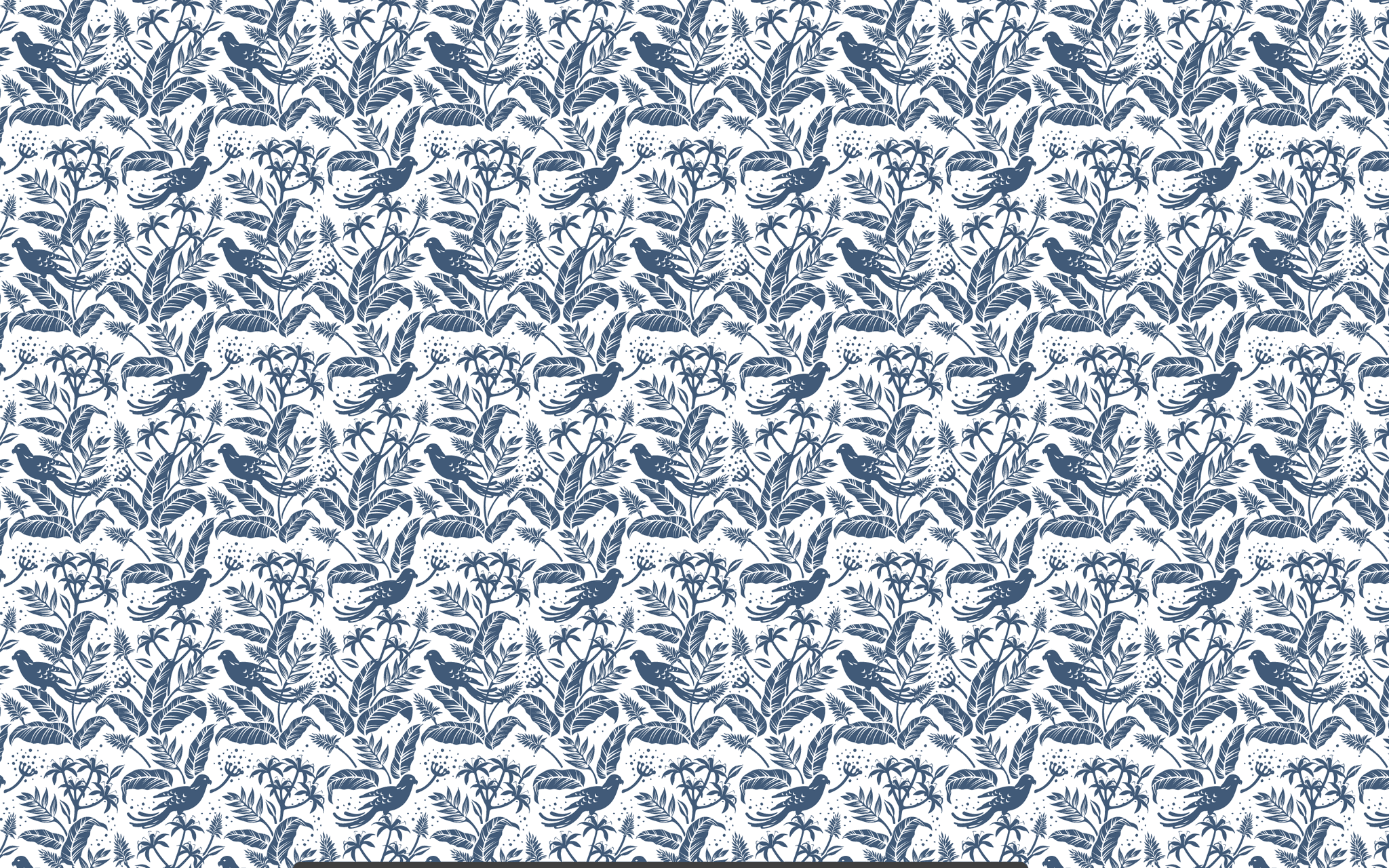
The Pattern
The Pattern
A Modern Take on Baroque Ornamentation
A Modern Take on Baroque Ornamentation
To enrich the labels and offer a sense of depth, I developed a custom pattern inspired by 17th-century Baroque vegetal motifs. My process involved:
Studying historical botanical illustrations
Reinterpreting their fluid, ornamental lines into simplified, contemporary forms
Eliminating visual clutter, replacing strict symmetry with balanced, airy repetition
Ensuring the pattern frames the product information without overpowering it
Designing a flexible system: the pattern could scale across different formats (labels, boxes, digital assets)
This created a signature look, elegant, breathable, and rooted in nature, aligned with the brand’s values.
Pattern result
Pattern result
Social Media
Social Media
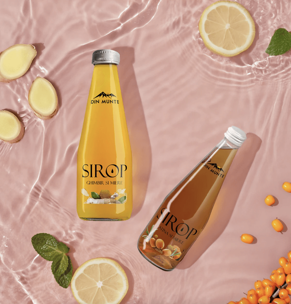
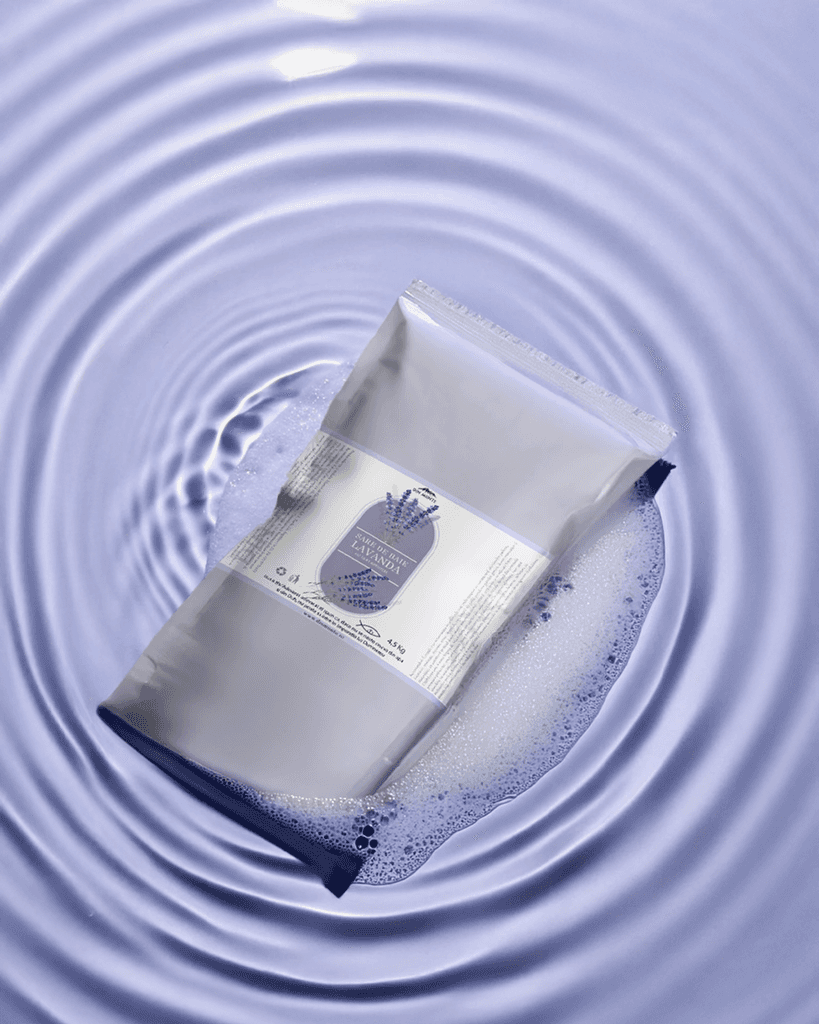
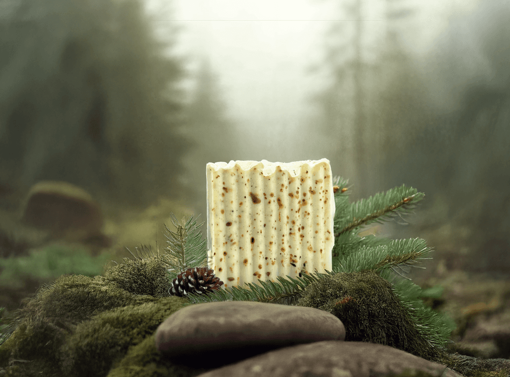
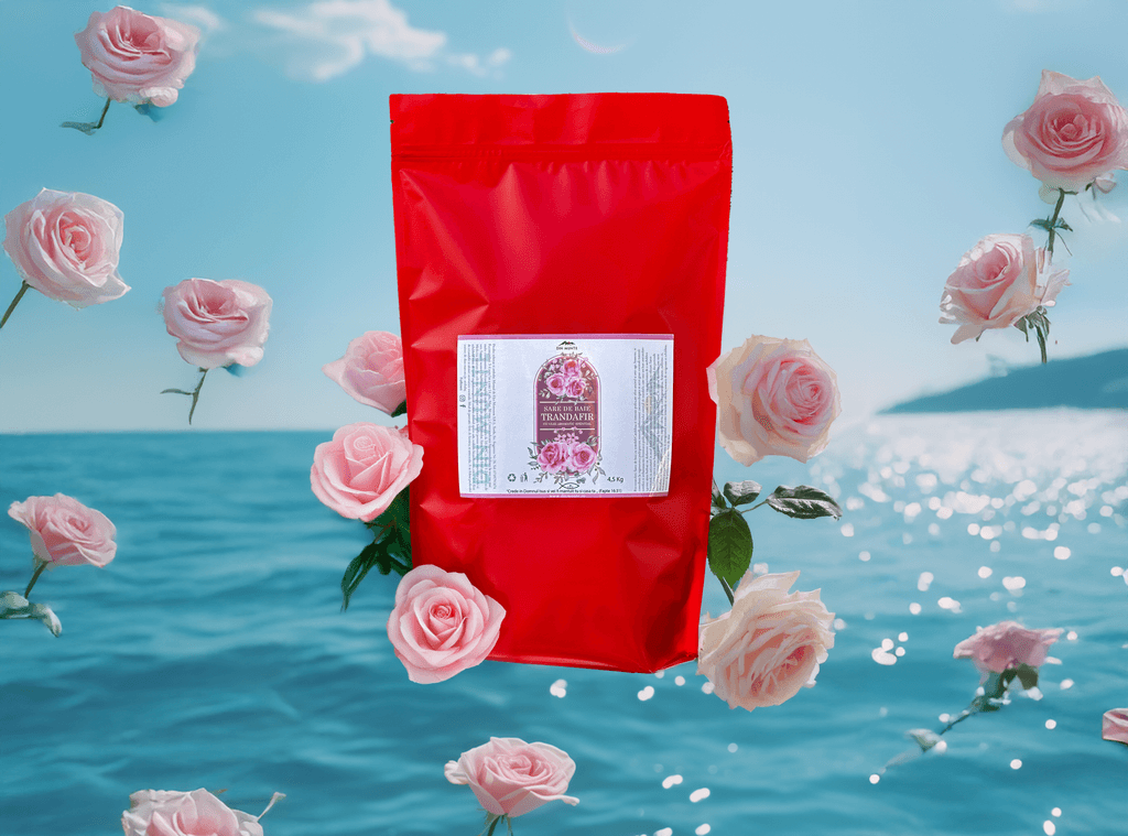
I created promotional visuals using the same color scheme, textures, and graphic elements from the packaging to ensure brand consistency across platforms. The posts were optimized for Instagram and Facebook, highlighting each scent's benefits and encouraging a sensorial experience through visuals.
Key elements:
Product-focused shots with natural backgrounds
Minimal copy with keywords like "natural," "calming," and "pure ingredients"

Let's work together
Let’s build something impactful together—whether it’s your brand, your website, or your next big idea.
Project Overview
Project Overview
Project Overview
Client: Din Munte
Product: Natural bath salts in multiple variants
Target Audience: Health-conscious consumers seeking relaxation and natural wellness products
Tone of voice: Refined, calm, trustworthy
Client: Din Munte
Product: Natural bath salts in multiple variants
Target Audience: Health-conscious consumers seeking relaxation and natural wellness products
Tone of voice: Refined, calm, trustworthy
Project Goals
Project Goals
Develop premium and elegant label packaging for 5 bath salt variants
Reflect the natural, therapeutic essence of each product
Reinforce brand identity and create visual differentiation
Create complementary social media visuals that translate packaging design into digital storytelling
Develop premium and elegant label packaging for 5 bath salt variants
Reflect the natural, therapeutic essence of each product
Reinforce brand identity and create visual differentiation
Create complementary social media visuals that translate packaging design into digital storytelling
Problem
Problem
The client needed a packaging design that would stand out both on shelves and online, reflecting the high quality of their natural ingredients without overwhelming the viewer. Additionally, they needed a visual system scalable to future product lines.
The client needed a packaging design that would stand out both on shelves and online, reflecting the high quality of their natural ingredients without overwhelming the viewer. Additionally, they needed a visual system scalable to future product lines.
The Label Design
The Label Design
Aesthetic Meets Function
Aesthetic Meets Function
Each label is built around a central layout grid ensuring clarity and hierarchy. I combined:
Classic serif typography for a premium, natural wellness vibe
Modern sans-serif for legibility and contrast
A top banner with the Din Munte logo, subtly integrated to preserve branding consistency
Carefully spaced zones for product name, scent type, and usage details
The Pattern
The Pattern
A Modern Take on Baroque Ornamentation
A Modern Take on Baroque Ornamentation
To enrich the labels and offer a sense of depth, I developed a custom pattern inspired by 17th-century Baroque vegetal motifs. My process involved:
Studying historical botanical illustrations
Reinterpreting their fluid, ornamental lines into simplified, contemporary forms
Eliminating visual clutter, replacing strict symmetry with balanced, airy repetition
Ensuring the pattern frames the product information without overpowering it
Designing a flexible system: the pattern could scale across different formats (labels, boxes, digital assets)
This created a signature look, elegant, breathable, and rooted in nature, aligned with the brand’s values.
Pattern result
Pattern result
Social Media
Social Media
I created promotional visuals using the same color scheme, textures, and graphic elements from the packaging to ensure brand consistency across platforms. The posts were optimized for Instagram and Facebook, highlighting each scent's benefits and encouraging a sensorial experience through visuals.
Key elements:
Product-focused shots with natural backgrounds
Minimal copy with keywords like "natural," "calming," and "pure ingredients"
Let's work together
Let’s build something impactful together—whether it’s your brand, your website, or your next big idea.